A component gallery to build from
Melis Design is the platform’s style guide — around 60 ready-made admin screens and UI components. The CSS ships with Melis Core, so you copy the HTML and start building.
Package
Type
Back-office
Demos
Styling
Depends on
Overview
Copy, don’t recreate
Melis Design is the platform’s style guide and component gallery: every demo is a controller that renders a .phtml, showing how a screen or widget looks with Melis Core’s CSS already applied. They’re templates to copy, not tools wired to real data.
The promise from the README: ‘All styles are already included with Melis Core. There is no need to look for CSS. Just find the HTML and JS if needed and start coding a plugin.’
Key features
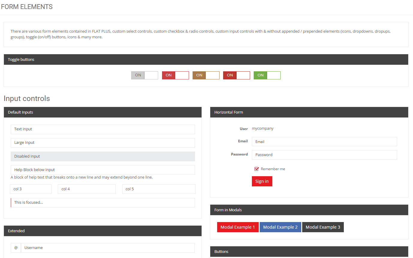
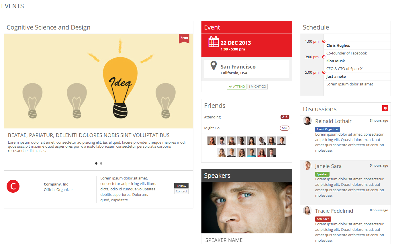
A gallery you build from
Ready-made screens and components, styled by Core, yours to copy.
~60 demo screens
App shells, profiles, support, commerce, medical, maps, galleries and more.
Built on Core’s theme
Every demo uses Melis Core’s admin theme (‘FLAT PLUS’).
Copy markup, not CSS
Take the HTML; the look comes from Core.
UI components
Buttons, icons, typography, alerts, modals, tabs, tables, charts, forms.
Read-only showcase
Nothing to configure — a gallery you browse.
Build faster
Reuse a demo when building a tool or a CMS plugin.
See it in action
Pick a screen, copy its markup
Browse the gallery, find the layout you need, and lift the HTML straight into your view.
Find a screen, copy it
Open the HTML (Designs) tool, pick a screen or component, and copy its markup straight into your own view.
- ~60 grouped demos
- Markup only — CSS from Core
- Build a plugin faster
For developers
How it's wired
Just .phtml to copy
Views live under view/melis-design/<area>/ and JS under public/js/<area>/.
Look comes from Core
Demos use Melis Core’s admin theme — no CSS to hunt for.
Browse under MelisCore
Appears as the ‘HTML’ tool (melisKey meliscore_tool_creatrion_designs).
// Find a design, copy its markup into your own view —
// the look comes from Melis Core, no CSS needed:
// view/melis-design/<area>/<demo>.phtml
// public/js/<area>/<demo>.js   (if the demo needs JS)
Ecosystem
Works alongside
Melis Design pairs with the modules you build on every day.
Build your back-office faster
See the design gallery in a live back-office.